Broken Yolk Cafe
Brand Identity
The Broken Yolk Cafe is a Southern California classic breakfast spot. Their current logo is very illustrative with conflicting colors and messaging, and has been since their opening in 1979. When rebranding this brunch favorite, I decided to keep the classic 1970’s style they encompass while adding a modern tasteful touch.
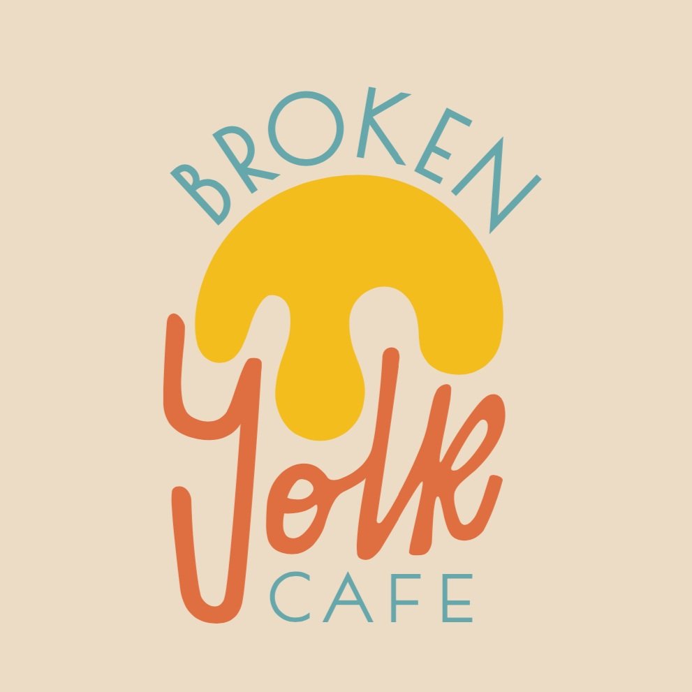
The logo design has a central shape with the words fitting into its space. The shape is a “broken yolk,” runny and warm. It also resembles the sunrise, something to symbolize this early morning cafe. Southern California lies along the coast, so this sunrise is something comfortingly familiar to the locals dining at the Broken Yolk Cafe.

A pattern created with the broken yolk of the logo.

The colors selected lie upon a sandy, natural backdrop. The sea teal, yolk yellow, and sunshine orange all originate from the warmth one feels when dining at the Broken Yolk Cafe, both physically and emotionally. I began by selecting the yellow shade as the perfect runny yolk color and complimented it with the teal and orange.


Preliminary concept sketches.
